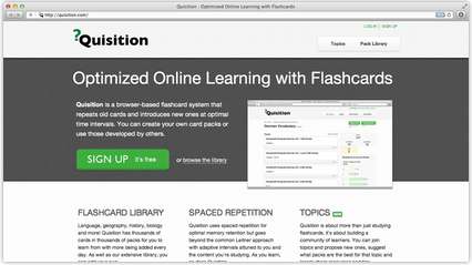
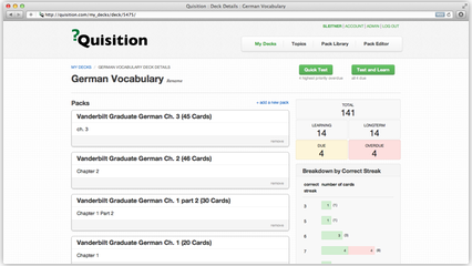
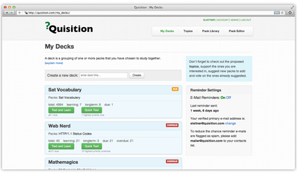
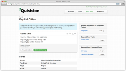
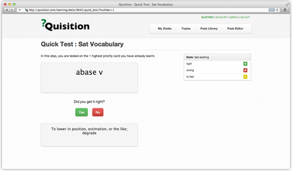
Pretty much every single page on the entire site was rethought. We tried to call out the actions available on each page more clearly, visually indicate different objects on the site with different styling and make better use of the side bar area to separate primary and secondary information.
We hope you find our new design easier to use and more of a pleasure to learn with. Take some time to look around, but here are some samples:
